WEBSITE DEVELOPMENT
SHOPIFY
COMMON
2024 – ONGOING
SOLUTIONS
CUSTOM SHOPIFY DESIGN AND DEVELOPMENT
COPYWRITING
TONE OF VOICE
PHOTOGRAPHY
ADVISORY SUPPORT
Common operated as a registered not-for-profit based in Aotearoa from 2019 to 2025, dressing people in collaboration with community groups and other organisations all with a common goal of redistributing material goods at a local level to support one-another within our communities.
This project included the creation of a new Shopify store, copywriting and writing an updated purpose statement. Site content was reorganised to allow for improved navigation and people being able to find the information they were looking for such as how to donate clothes or learn more about the organisation.
HOMEPAGE
Reflecting their progressive approach as a not-for-profit, the site diverges from legacy charity aesthetics or underdeveloped digital experiences reflecting common’s approach to care.
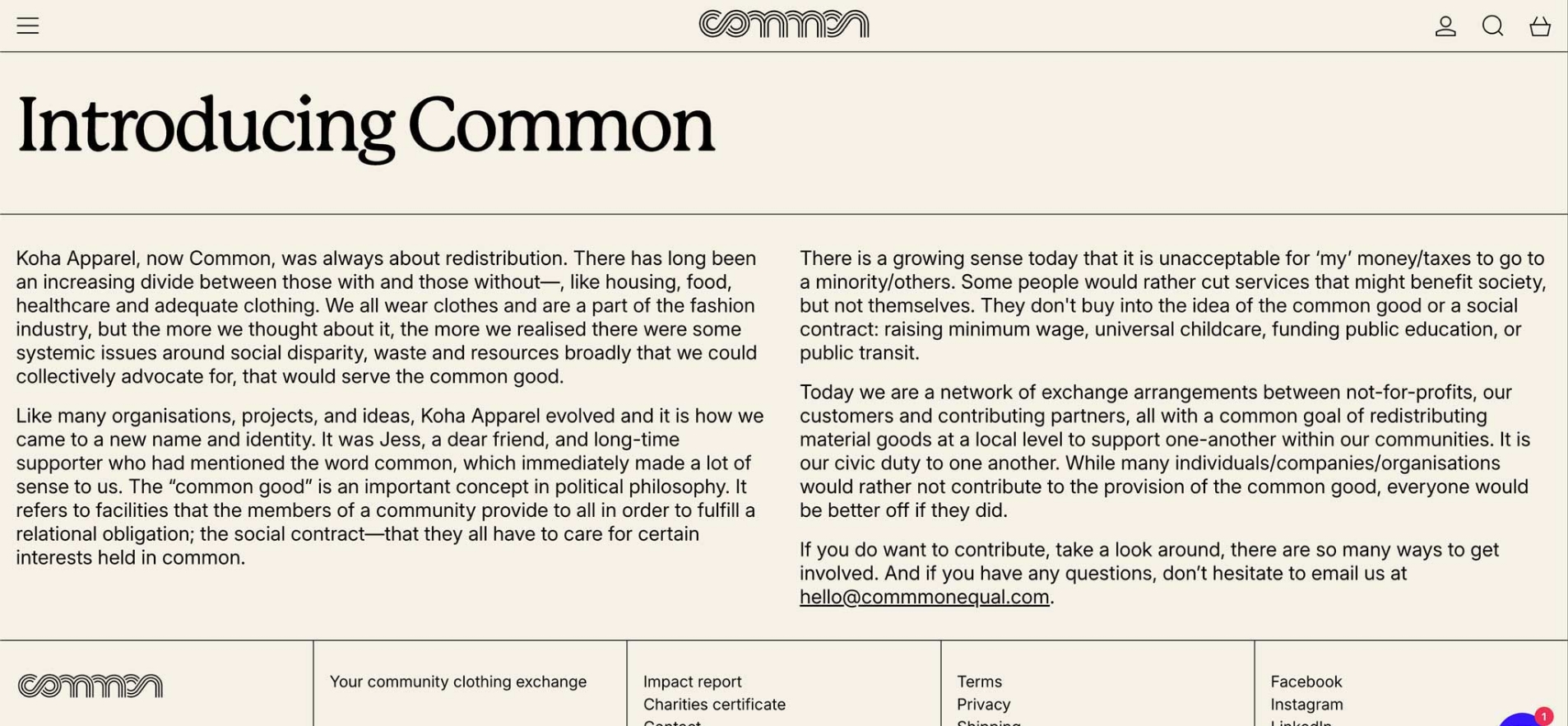
ABOUT PAGE
A clear typographic system and measured line lengths prioritise legibility and pacing to guide attention across the desktop and mobile experiences.
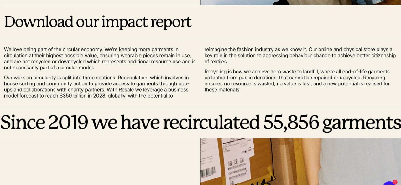
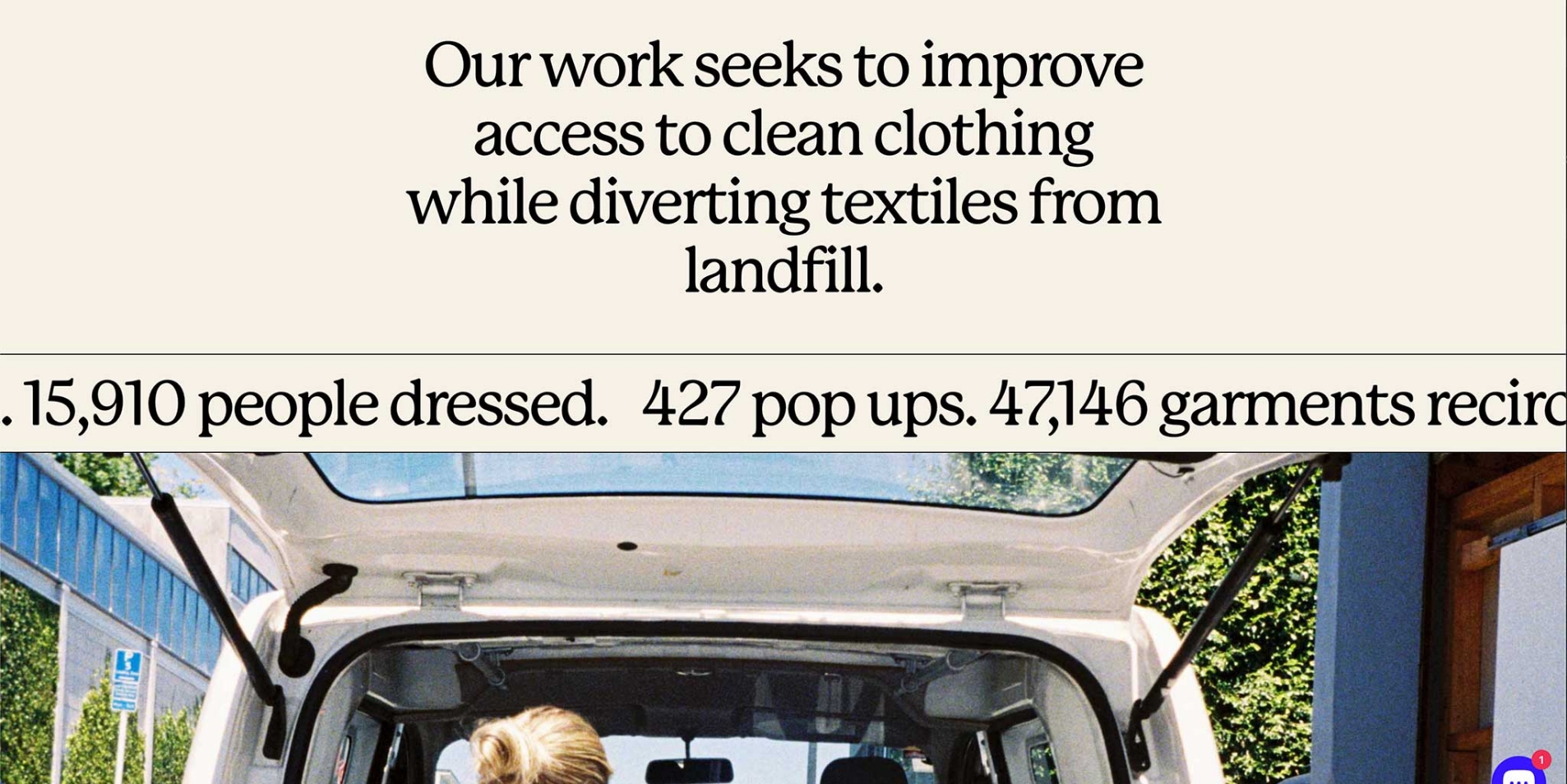
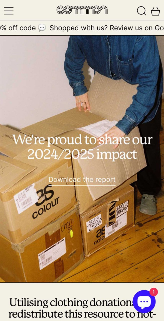
IMPACT REPORT PAGE
Transparencies are conveyed through large-format typeface and restrained layouts. typographic hierarchy, column structure, and scale balance narrative context with quantitative outcomes.
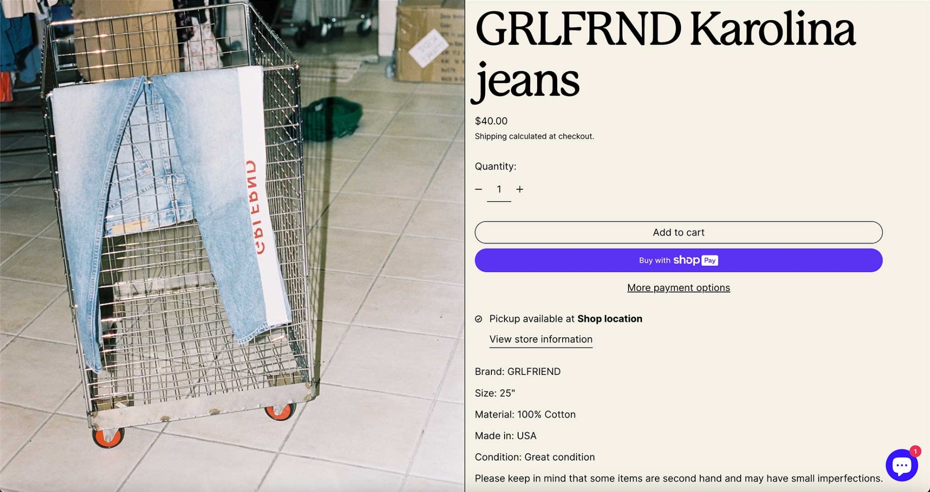
PRODUCT PAGE
Resale pages mirror those of contemporary fashion e-commerce, utilising considered imagery, layout, and hierarchy to redefine op-shop aesthetics. this approach supports shifting attitudes toward resale while positioning common as a credible industry partner.
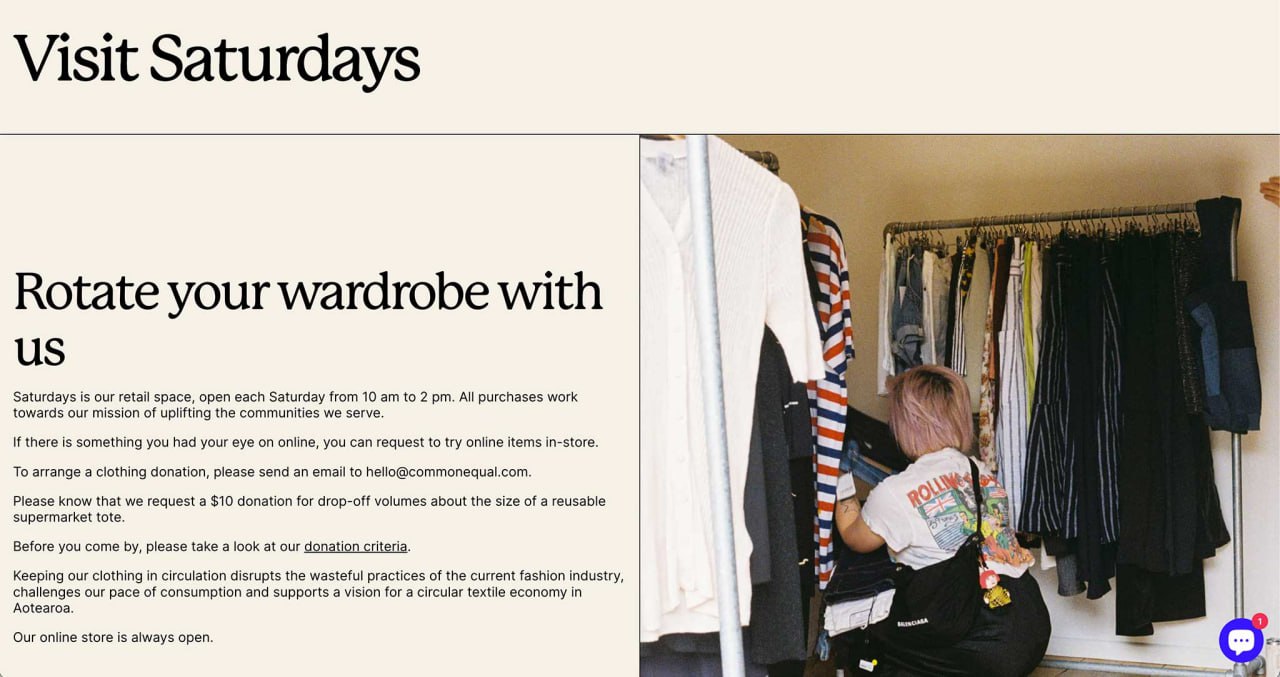
VISIT PAGE
Operational information is presented through a clear text-led layout detailing opening hours, donation criteria and booking drop-off processes. Supporting imagery provides context, differentiating from community and public operations.
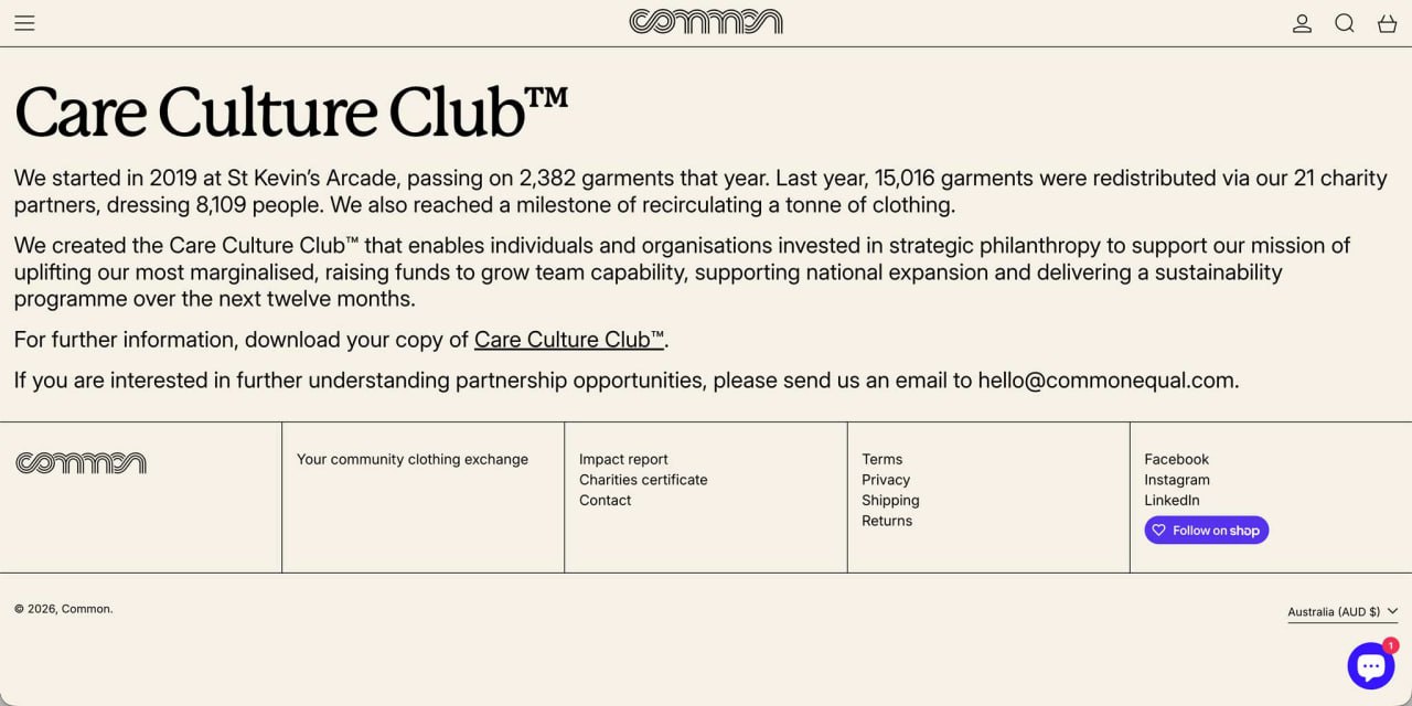
CARE CULTURE CLUB™ PAGE
Dedicated programme pages provide structure for inviting partnership-led initiatives, balancing transparency, accountability, and ongoing engagement.
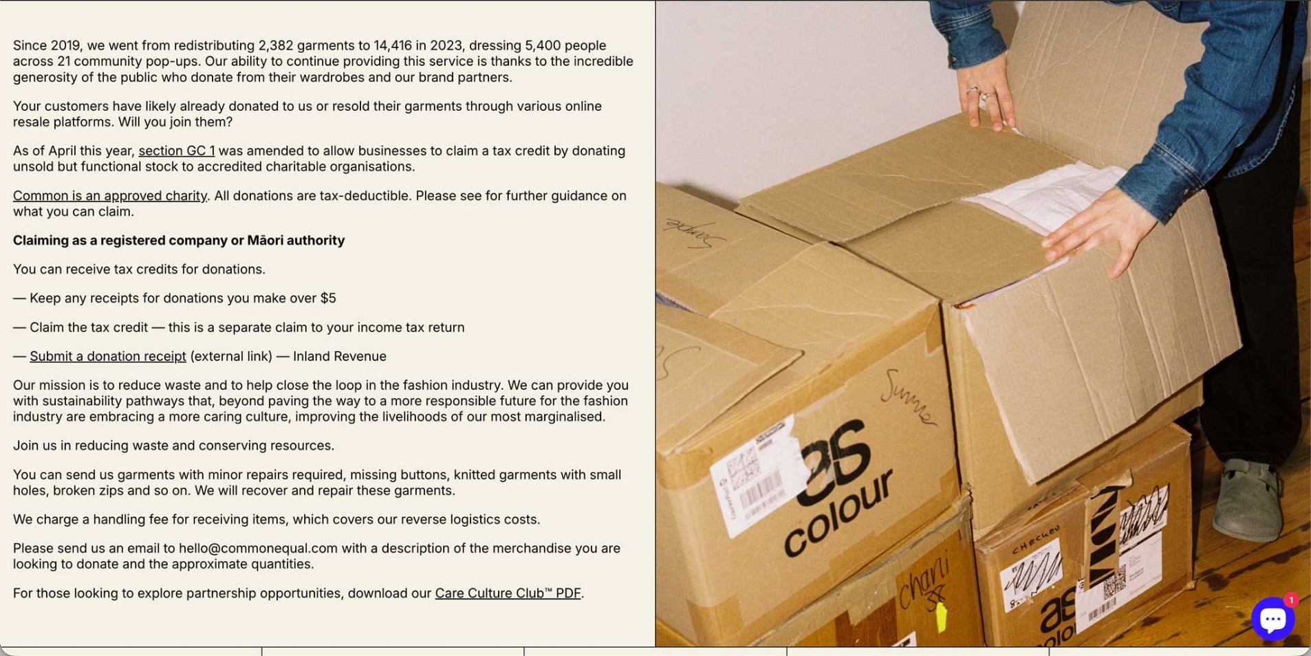
DONATE DEADSTOCK PAGE
Layout and typography are used to organise complex regulatory and operational information, reinforcing trust and inviting informed industry participation.

MENU
A side bar navigation system presents clear pathways for participation in-line with site information architecture. this approach makes it easy for different audiences to find their entry point without overwhelming user experience.
HOMEPAGE
A layered messaging approach allows the homepage to communicate multiple priorities at once, balancing editorial content with functional updates. A regularly updated announcement bar supports short-term prompts such as reviews, bookings, or events while hierarchy and layout allows for distinct messages to be conveyed without requiring users to scroll.
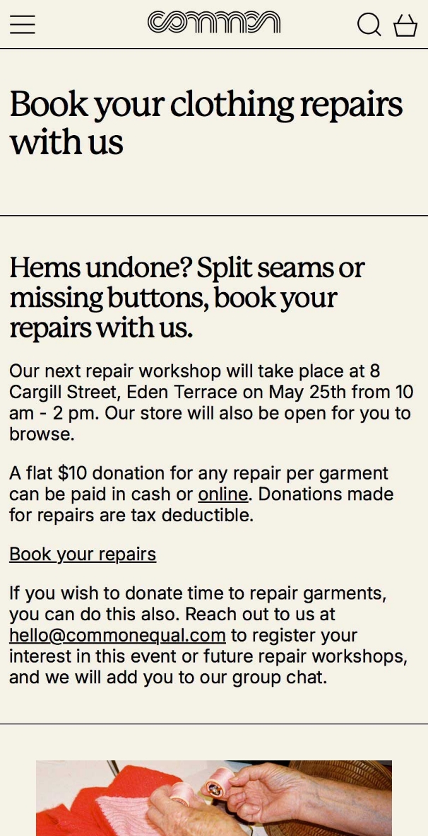
REPAIR SERVICES PAGE
A utilitarian text-led layout and integrated google calendar bookings frames repairs as a practical service while maintaining consistency with the broader site language and visual restraint. Film photography is used intentionally, aligning with Common’s emphasis on slow fashion.
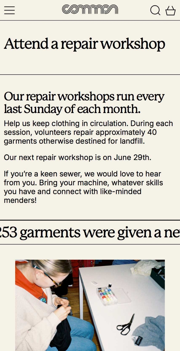
REPAIR WORKSHOPS PAGE
Prioritising scannability, fundamental details are formatted alongside contextual information supported by an announcement banner to surface live impact alongside upcoming sessions. The restrained typographic system supports quick scanning and easy access of practical information on mobile.